Still data experts,
just more
calculated.
We’ve always understood the value of good quality data and the role that plays in helping organisations to effectively communicate with their customers, generate leads and sales, and raise brand awareness.
But, what we do has changed since we first called ourselves Qbase Data Services. The name ‘Qbase’ stems from ‘Quality Database’ – a relic from our database compiling heritage in the 1990’s.
Today we feel that the Qbase name no longer encapsulates what we do. Now, as we have done for some time, we are focused on mobilising data to fuel sales, build loyalty, and transform customer experiences.
To mark our new identity, we wanted a name that reflected our core values of being curious, resourceful, and progressive. And for this, Euler was perfect.
Our New Identity
And where it came from.

Why Euler?
We take our name from Leonhard Euler, a Swiss mathematician, logician, and engineer from the 18th century. He is known for his curious mind and his dedication to solving real-world problems using maths.
His resourcefulness was boundless, adopting and adapting existing techniques to pioneer new branches of analysis and thinking.
He progressed maths and analysis into completely new areas, building on the ideas of others and taking them to limits never before imagined.
We feel Euler represents everything we strive to be as a company. We always push boundaries and ask questions.

Our new logo
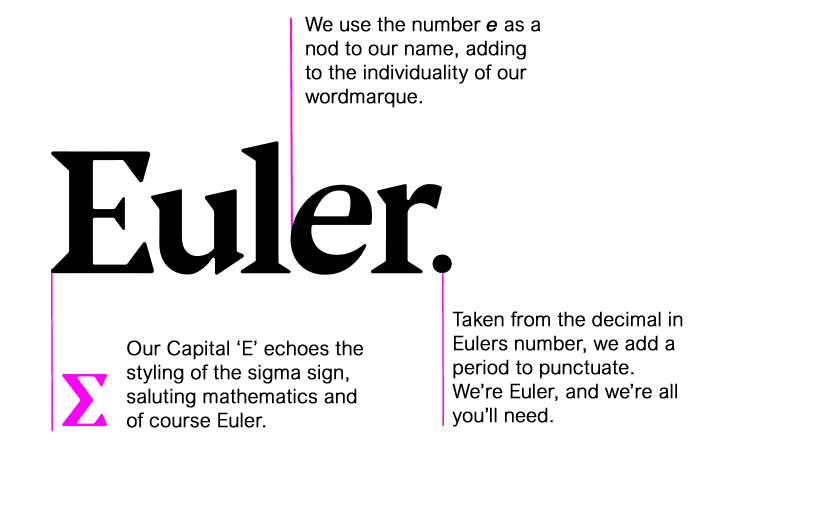
We feature several tributes to Euler in our logo. Since Leonhard Euler was the first to use summation notation using the Greek letter Σ, we’ve borrowed some styling from this letter within our capital letter ‘E’.
The italic, lower case second ‘e’ represents Euler’s number and most famous work – a mathematical constant approximately equal to 2.71828 that has been applied in probability, compound interest, and optimal planning.
Finally, the full stop at the end of our logo symbolises the decimal point in Euler’s number.

Our new visuals
We have a strong and identifying core purple – signifying our wisdom and creativity.
The pink highlights represent our friendliness and approachability. And show how we are not afraid to stand out from the crowd with new ideas and new thinking.
Our dots and lines patterns you will see appearing around the website and on our images symbolises our extensive work in bringing data together – connecting the dots.
And, of course it is also a visual suggestion of a Eulerian graph.
Related Resources
Other articles about our rebrand
We recently worked with Parkinson’s UK to improve their data quality and help inform the data architecture….
In this whitepaper Rob Jones explains exactly why analysing your data landscape prior to starting your project…
In the past 6 months, we’ve seen an explosion in the number of people asking us to…


